

The making of a Drift cover
Behind the scenes with our print designer


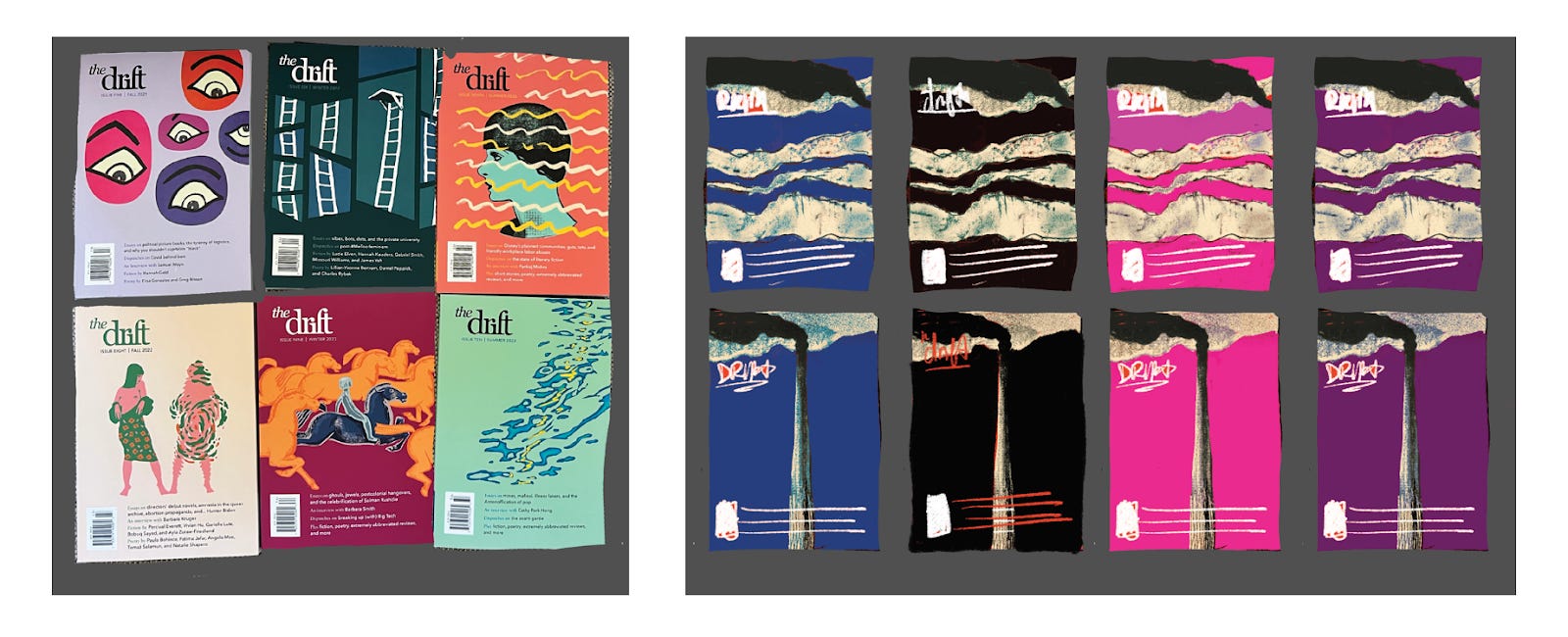
All Drift covers follow a few strict rules. The design needs to be based on a single existing cover either from the archives of The Masses, the early-twentieth-century socialist magazine from which The Drift draws inspiration, or its successor publication The Liberator. It needs a solid background and some repeating visual element: smokestacks, horses, or ladders, to name a few examples. Finally, while the design can be figurative, its exact meaning must remain ambiguous — it must not directly reference or illustrate contemporary world events. The first rule, the most important and consistently followed, was established by the magazine’s co-founders, who designed the first online-only cover in 2020, and John Kazior, the magazine’s art director and the creator of subsequent digital covers. The Drift entered into print starting with Issue Five in summer 2021, which is when I came on board as the designer, taking over responsibility for the cover. That issue’s cover ended up featuring a repeating eye motif, based on a 1922 issue of The Liberator. The initial intention was not to establish a new rule for all subsequent covers, but when I started drafting Issue Six the team liked the idea of repeating elements so much we decided to keep it going.
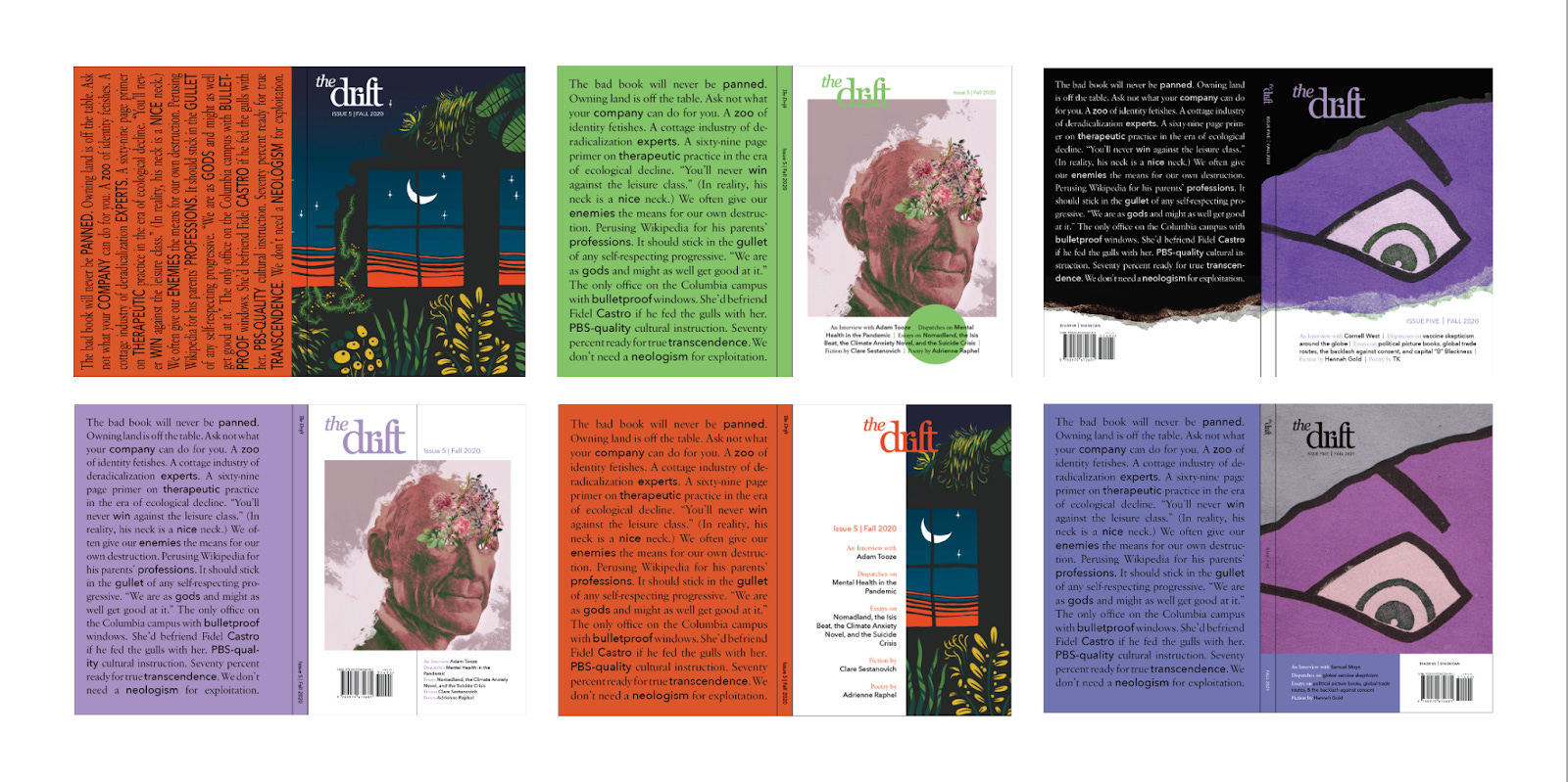
We’ve been working together on the print magazine for four years, so our design process has shifted and been refined over time, but the basic steps remain the same. This is how one of my favorite covers, Issue Eleven’s smokestacks, came together.
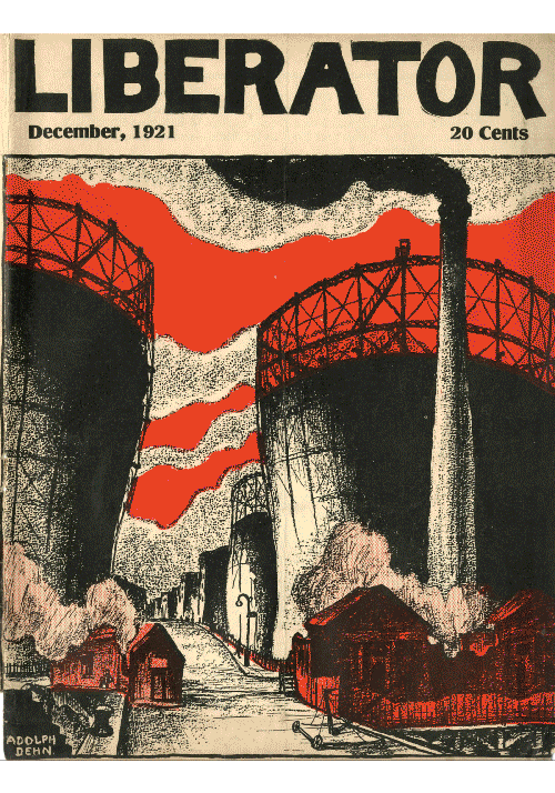
I always start out by sending the editors a few thumbnails in grayscale, since color isn’t relevant at this early stage. These sketches are intentionally loose; they are mostly meant to figure out which elements we want to pull from the original cover. For Issue Eleven we decided to adapt the Liberator cover depicted on the left below. The editors liked the ominous ambiguity of the man-made structure and its contrast with the motifs featured on the previous two covers — abstracted light on water, for Issue Ten, and a boy and several horses, for Issue Nine.
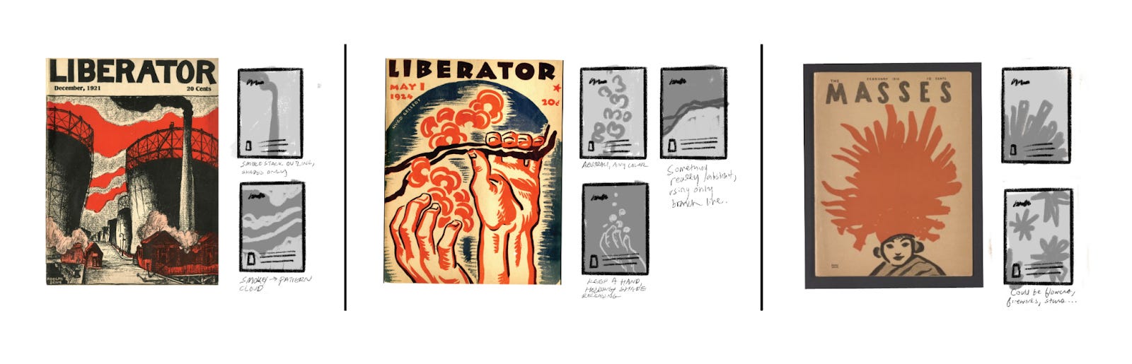
From those first thumbnails I created some slightly more detailed sketches for the team to look at — quick digital collages we can use to decide which direction to move in. The comparison below helped the editors decide to highlight the smokestack, stripped away from the surrounding landscape.
While this discussion about the composition was ongoing, I also solicited feedback on color, which I’ve found is helpful to tackle in a separate conversation. For some issues, I fine-tune the colors right until we send the final cover design to the printer, but for Issue 11, the color scheme came together quickly. I mocked up a few options, displaying them alongside our previous print issues. Ideally each cover’s color is distinct from the rest, and especially from the one right before it. At this point we only had six print issues, so it was easy enough to find colors we hadn’t used, like something dark, or a vibrant purple or pink. Ultimately everyone liked the blue the most, and with a few minor tweaks, that was the shade that appeared in print.
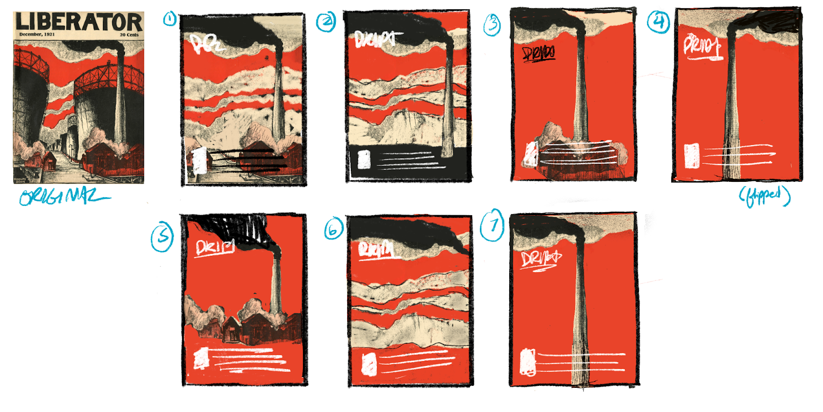
With the two major decisions made — color and key design elements — we entered the last phase of sketches. After the editors decided on the smokestacks, in addition to the clouds, as repeating visual elements, I did a final round of sketches exploring how the stacks and their smoke could interact, and the one circled on the bottom right below was the crowd favorite.
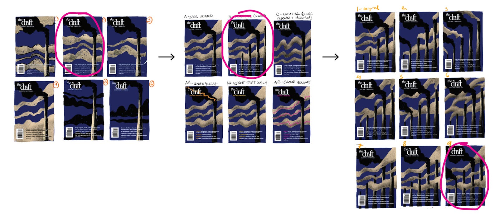
At this point I felt we had sufficiently committed to a direction and I could start doing full-size illustrations. There were a couple more small decision points (should the black clouds get some additional depth? How best to do that?) and a few other accent colors we considered (a bright orange, pink, and green), but because we spent so much time refining the basic design, once we hit high fidelity I was just making minor adjustments.
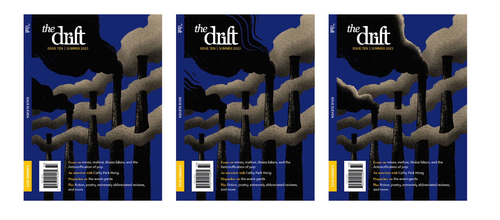
Once the cover image was locked and the text on the front and back was updated, we were ready to get proofs from the printer. The colors always look a little different on paper than on screen, so I send the printer four slight variations of the cover (in this case one file with the same color as the digital cover, one lighter, one darker, and a wildcard pushing more purple), and the printer mails me back four physical proofs. The differences are subtle, especially in photographs, but noticeable in real life. The actual cover will print with a matte finish, while these untreated proofs are glossy, so I have to make my best guess about what will look most similar to my digital designs, knowing that I’ve done all I can and there’s an element that’s out of my control. For this reason, it is always exciting to get my hands on the final treated, bound issue. And I hope our readers feel the same!

Ivy Sanders Schneider is the print designer of The Drift.
I love reading about this process, thank you for sharing. It’s so nice to get a view of not just the final product so I hope you share the process illustrations for future covers as well!